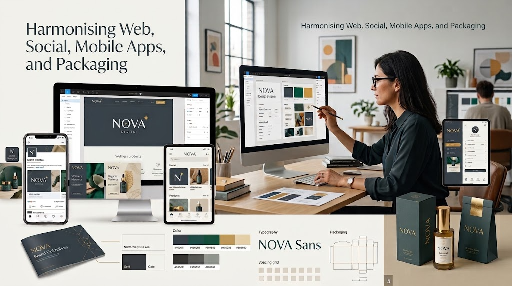
A cohesive visual identity is more than a logo placed on random collateral. It is a systematic framework that balances typography, colour psychology, spatial grids, and user experience across four essential pillars: responsive websites, social media graphics, native mobile apps, and physical packaging.
1. Responsive Website Design: The Conversion Engine
Your website is the central conversion hub of your brand. An effective web design balances brand storytelling with speed, scannability, and accessibility.
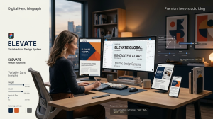
- Fluid Typography & Modular Scales: Using CSS clamp() alongside variable fonts ensures that headlines scale gracefully from mobile displays to 4K monitors without awkward wrapping or Cumulative Layout Shifts (CLS).
- WCAG 2.2 AA Compliance: High aesthetic appeal must never sacrifice legibility. Body text requires a minimum contrast ratio of 4.5:1 against the background to prevent cognitive fatigue and ensure full readability.
- Conversion Hierarchy: Strategic negative space directs user attention to primary conversion points rather than overwhelming visitors with decorative clutter.
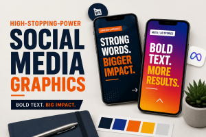
2. Social Media Graphics: The 1.5-Second Visual Hook
3. Mobile App Design: Ergonomics and Micro-Interactions
- Spatial Discipline: Strict 8pt baseline grids keep touch targets accessible (minimum 44×44pt) and maintain alignment across varying device viewports.
- Component Reusability: Building an atomic UI kit (buttons, form fields, modals, navigation bars) ensures the app interface remains predictable and intuitive throughout the user journey.
4. Packaging Design: Translating Digital Systems into Tactile Reality
- Substrate & Ink Compensation: Physical printing involves ink bleed, material absorption, and texture. Typography on uncoated paper or dark substrates (knockout text) often requires slight weight reductions to keep letterforms sharp.
- Curvature & Viewing Angles: Front-of-pack typography and visual anchors must be calibrated for 3D curved surfaces (bottles, pouches, tubes) to maintain readability from shelf distances.
- Material Finish & Contrast: Spot UV, foil embossing, and matte varnishes should complement the digital visual system rather than conflict with established brand tokens.
5. Integrating Human Art Direction with AI Workflows
Generative AI tools accelerate moodboarding, texture generation, and lifestyle mockup creation, but high-performing brand assets require human creative direction.
Generative engines cannot calculate responsive breakpoints, evaluate physical die-lines, or ensure brand token consistency across hundreds of assets. Experienced designers direct the AI process, using automated tools for speed while applying technical precision, typography craft, and commercial strategy to the final deliverables.
Frequently Asked Questions
What is the advantage of using a unified design system across digital and print?
A unified design system establishes consistent design tokens (colors, typography scales, spacing rules) across every medium. This maintains recognizable brand equity, reduces user friction, speeds up development and production handoffs, and prevents costly design rework.
How do design tokens connect web design to mobile apps?
Why does typography render differently on packaging compared to digital screens?
How do accessible design choices improve business conversion rates?
What file formats should be used when exporting cross-platform assets?
- Web and UI: Vector SVGs for icons and logos; modern WebP or AVIF for photographic content.
- Social Media: High-resolution PNGs or optimized WebP files formatted to exact pixel ratios (1:1, 4:5, 9:16).
- Packaging Print: High-resolution, press-ready vector PDFs with embedded fonts, CMYK color profiles, and explicit die-lines and bleeds.