Typography is the foundational structure of user experience. When users land on a website, open a mobile app, or scroll through a social feed, text delivers over 90% of the information they consume. Yet, many brand redesigns stumble because their typographic systems are treated as static decoration rather than dynamic, scalable engineering.
A slab-serif typeface like Arvo brings geometric structure, editorial authority, and warmth to a brand identity. However, scaling an identity across high-density mobile viewports, responsive websites, fast-scrolling social ads, and physical packaging requires far more than picking a single font weight.
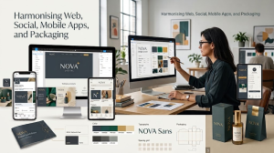
Building a modern, conversion-focused typographic hierarchy requires leveraging variable font technology to unify digital products, marketing feeds, and physical collateral.
1. Why Typography Fails at the Multi-Channel Handoff
In traditional design workflows, branding teams define typography inside static presentation decks: a headline at 48pt, body copy at 16pt, and captions at 12pt. The breakdown happens during execution:
- Performance Drag: Loading four distinct static font files (Regular, Italic, Bold, Bold Italic) adds 150KB–400KB of network overhead, directly harming Core Web Vitals like Largest Contentful Paint (LCP).
- Responsive Layout Shifts: Fixed desktop type scales crowd smaller mobile screens, causing unintended wrapping, awkward line breaks, and Cumulative Layout Shifts (CLS).
- Legibility Loss on Packaging & Micro-UI: Subtle hairline details or uncalibrated stroke weights dissolve when printed at small scales on matte materials or displayed inside 14px mobile interface elements.
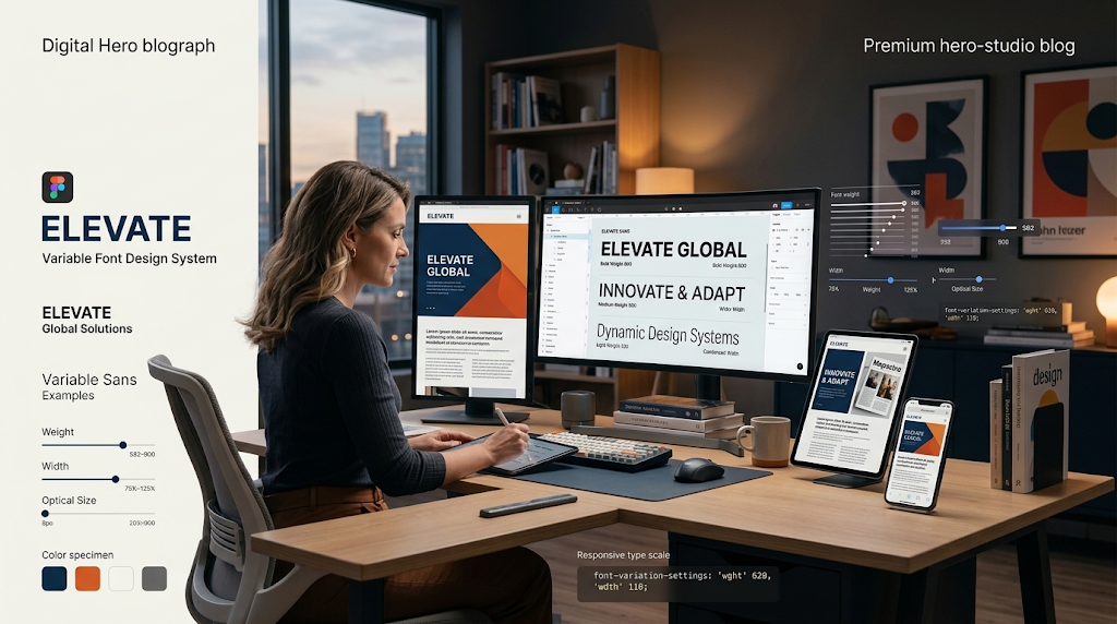
Variable fonts resolve these pain points. A single font file houses an entire design space along continuous axes (weight, optical size, and width), enabling responsive, performance-first typography.
2. Setting Up the Foundation: The Arvo Variable System
Arvo is a geometric slab-serif designed for legibility and visual presence. When deployed as a variable font, its structural serifs provide stable horizontal baseline anchors, making it an effective anchor for headlines, product packaging, and key conversion hooks.
Typographic Pairing Logic
While Arvo excels as a display and structural header typeface, pairing it with a high-legibility geometric or neutral sans-serif (such as Inter, Work Sans, or Plus Jakarta Sans) for dense body paragraphs creates the ideal balance of personality and effortless scanability.
3. Implementing the System Across 4 Core Touchpoints
Responsive Website Design & Fluid Scales
- Desktop Strategy: Use Arvo at heavier optical weights (700–800) with slight negative letter-spacing (-0.02em) to command attention above the fold.
- Mobile Viewports: Dynamically adjust the variable weight slightly downward (e.g., from 750 to 650) to prevent thick slab serifs from overwhelming narrow screen widths.
- Mobile App UI & Micro-Interactions
- Inside native iOS and Android applications, screen real estate is constrained. Slab serifs must be applied deliberately:
- Section Headers & Empty States: Use Arvo at medium-heavy weights (600–700) for feature onboarding, empty states, and section banners to retain brand character.
- Avoid Slab Serifs in Data-Dense UI: For tabular lists, form fields, and navigation bars, swap to your paired sans-serif set at a crisp 400–500 weight. Use standard tabular numerals to ensure checkout figures align vertically.
- Dynamic Type Support: Ensure the layout system supports accessibility scaling (allowing users to increase system font sizes without breaking containers).
Product Packaging & Physical Touchpoints
- Stroke Weight Compensation: On tactile kraft boxes, recycled paperboards, or dark background substrates (reverse knockout text), slab serifs can fill in during printing. Adjust the variable weight down by 5%–10% to preserve internal counters.
- Kerning & Tracking for Distance: Increase headline tracking on physical packaging by +0.01em to +0.03em. This ensures clear visibility from retail shelves or unboxing angles.
- Hierarchy on Curved Surfaces: Ensure key brand promises and variant titles fit within the front 40% focal arc of cylindrical bottles or pouches.
4. The Modern Workflow: Figma Tokens to Production Code
5. Integrating AI into Typographic Exploration
AI tools accelerate early typographic and conceptual testing when guided by senior creative direction:
Contextual Layout Prototyping: Use generative AI canvas tools to rapidly simulate mock product packaging in realistic retail settings or generate photorealistic lifestyle backdrops for ad templates.
- Testing Dynamic Copy Lengths: Use language models to produce variable-length headline strings (short, medium, long) to stress-test your responsive CSS layouts before deployment.
- Human Oversight Matters: AI cannot calculate optical baseline adjustments, WCAG colour contrast ratios, or fine-tune tracking across physical print plates. Human design judgement ensures technical precision, brand alignment, and accessible user experiences.
Frequently Asked Questions
What are variable fonts, and why are they better for websites?
Variable fonts store an entire family of weights, widths, and styles inside a single compact file. This eliminates the need to load separate files for each font weight, reducing HTTP requests, improving page load speed, and boosting Core Web Vitals scores.
Can a slab-serif like Arvo be used for long-form body text?
While Arvo works exceptionally well for headlines, short callouts, and packaging labels, dense body copy is typically easier to read when set in a clean geometric or neutral sans-serif (such as Inter or Work Sans) to reduce visual fatigue on screens.
How does typography directly impact conversion rates?
Strategic typography establishes an effortless visual hierarchy. When headlines, benefit callouts, and call-to-action buttons use calculated contrast, spacing, and scale, users process value propositions faster, reducing friction and increasing conversion actions.
What is the ideal contrast ratio for accessible web typography?
Under WCAG 2.2 AA guidelines, normal body text must maintain a contrast ratio of at least 4.5:1 against its background. For large text (18pt / 24px regular, or 14pt / 18.66px bold and above), the minimum required ratio is 3:1.
How do I adapt digital typography rules for physical packaging?
Physical packaging requires manual adjustments for ink absorption, substrate texture, and surface curvature. It is best practice to increase letter-spacing slightly and reduce stroke weight on dark backgrounds (knockout text) to prevent ink bleed from muddying character counters.
How do design tokens streamline typography handoff?
Design tokens define typographic values (family, size, weight, line-height, letter-spacing) as shared variables. This ensures complete consistency between Figma components, web stylesheets, and mobile codebases, eliminating manual errors during development.